Making payments infrastructure instantly clear, at enterprise scale
Creative strategy across high-spend campaigns, where comprehension had to scale as fast as the budget.
The problem
Finix works in payments infrastructure, technically complex and easy to overcomplicate. At high spend the failure mode isn’t cost, it’s clarity: weak hooks and dense messaging just amplify low engagement. The job was to make a complicated product instantly understandable, and hold that clarity across a large volume of creative.
The insight
For finance decision-makers, loss aversion beats feature lists. The fastest way into a complex product wasn’t explaining how it worked, it was naming what it was costing them not to switch.
The bet
Rather than explain the product, I simplified the message into a few high-impact angles and let clarity carry the spend:
- Financial loss: “you’re overpaying”, leads with the pain, not the platform
- Outcome-driven: “save up to 40%”, concrete number, zero jargon
- Niche targeting: regulated retailers, vape brands, underserved by mainstream processors, high switching intent
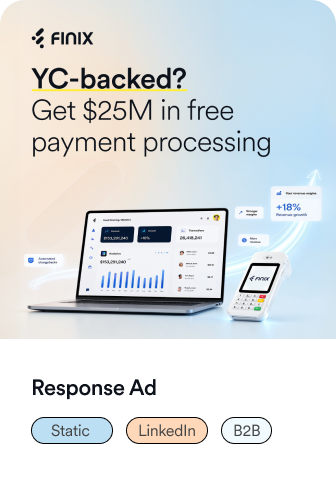
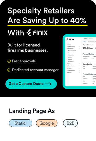
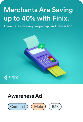
Everything was built for fast comprehension, high-intent audiences, and multi-format testing across video and static.
What I deliberately avoided: clever, layered creative that wins design awards but costs a half-second of comprehension, at this spend, that half-second is expensive.
The result
Reduced CAC by 24% in 90 days. Clarity didn’t just hold across the spend, it compounded against it.